Friday, March 28, 2008


Friday, March 21, 2008
Happy Weekend
This Concrete Pod by Architect Kazuya Morita is a piece of Sculptural beauty. Just think of all the different applications for this amazing piece.........
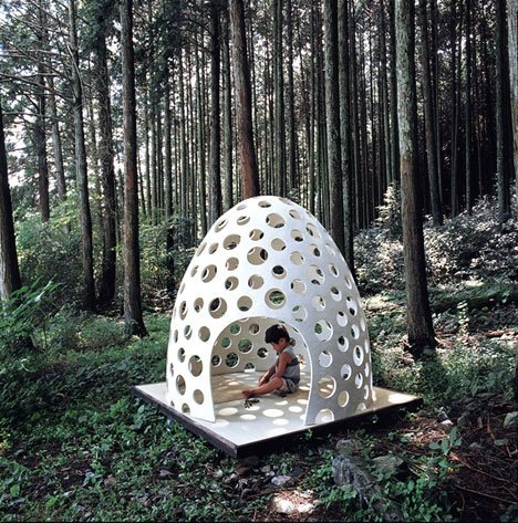
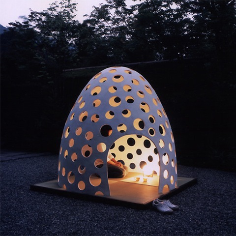
"Concrete-pod" is micro-space furniture for private and public use made of extremely thin concrete. In the dome, because of its minimal scale, it makes us more sensitive and relax perhaps like when we are in a traditional tea-house CHA-SITSU. It was exhibited in "Concrete Art Museum 2005" in Nagoya, Japan.
"Concrete-pod" is made from fiber reinforced concrete, which is the mixture of white cement and light-weight aggregate and glass fiber. By application of Japanese traditional plasterer's skill SAKAN, it was plastered on the dome-shaped mould by a trowel. After hardening, the mould of Styrofoam was dismantled and removed.
The diameter and the height of "Concrete-pod" is 1700mm each, thickness of shell is 15mm only. A minor axis of a hen's egg is about 40mm and thickness is 400 micron, so it means this concrete-shell is just like an expansion of a hen's eggshell. Though it's "hen's egg thin", "Concrete-pod" has the enough strength that a grown-up man can climb up. Even when you are in the "Concrete-pod" which is tenderly covered by the concrete-shell, you can feel the outside environment through the number of the holes, so it makes us feel indoor and outdoor at the same time, and takes us to the sensitive feeling and deep relaxation in the nature.
Patricia Gray writes about Interior Design inspirations, emerging trends, and the world of Design.
While you're here, subscribe to this feed so you don't miss out.
Thursday, March 20, 2008
Nursery Wallpaper
How cute is this wallpaper? It is some of the nicest wallpaper I have seen for children's rooms. It is from a British company called Fromental. Established in 2005, Fromental produces a beautiful line of hand painted wallpapers. The Company is headed by Tim Butcher, former seven years Creative Director of world-renowned hand-painted Chinoiserie house de Gournay. Their latest line is called "Brainchild" (I love that name), and is a mini collection of 3 fun layouts for children's rooms. The pictures show the colorways available in each series. The schematic shows how the panels go together to create a mural on the wall.
Wednesday, March 19, 2008
Farrow & Ball Launch 18 New Colors
Farrow & Ball Paint has just introduced 18 new paint colors in their line. I like the Farrow & Ball Paint range because it is complete yet concise. The specification of the product is very clear without too many different finishes or too large a product range to make it confusing. To use, it is just superb, like brushing silk onto the walls. The depth of colour can only be compared to silk, a fibre with a great capacity for pigment.
The product is premixed ensuring good colour matching. Every Farrow & Ball Paint colour is perfect. It is the exact shade or tint that works for a particular colour. The depth of colour and finish is way above all other paints. Every colour is a winner.
I also love the names of the colours; no other product allows you to specify ‘Drab’ and have the result be fabulous! I am especially happy to see the bottom 3 new Farrow & Ball colors: Pelt, Tanners Brown & Pitch Black and can hardly wait to try them. Wimborne White and Skimming Stone will definitely be on my list of new whites to try. I have paired some of these Farrow & Ball colors to pictures that I think might closely approximate the new paint colours in their line, so you can see how they might work in a room setting. Paint is a wonderful avenue for decorating. I always tell my clients that one colour doesn't cost anymore than another, but it can make all the difference in the world.


In rooms like the ones above I would use Farrow & Ball Paint No. 239 Wimborne White to bring out the detail in an all white space.
Photos Scott Yetman

Farrow & Ball Paint No.254 Pelt - A rich plum-brown, would be an elegant and very current choice for this room.

Farrow & Ball Paint No. 264 Cinder Rose for this room - "a fresh mauve colour" with perhaps just a little more pink in it than this picture.

Farrow & Ball Paint No.244 London Clay - the name says it all.

Farrow & Ball Paint No.242 Pavilion Gray - a pretty light gray

Farrow & Ball Paint No.249 Lancaster Yellow - a fresh and clean pale yellow

Farrow & Ball Paint No.247 Terre D'Egypte - a deliciously warm red-brown terracotta

Farrow & Ball Paint No.253 Drawing Room Blue - A traditional ‘salon’ blue, this colour’s clean hue is reminiscent of the pigment Cobalt,
used by artists and discerning decorators ever since its discovery in the 19th century.

Farrow & Ball Paint No.248 Incarnadine - A rich, crimson red, similar to the red gloss paint used by the late David Hicks
at Baron’s Court in the 1970s.

Farrow & Ball Paint No.240 Cat's Paw - A stylish, yellow-based neutral colour which has an especially soft tone.

Farrow & Ball Paint No.251 Curlish Green - A yellow-green colour has been used decoratively for centuries,
both on its own and as a ground beneath patterned wallpapers

Farrow & Ball Paint No.245 Middleton Pink - A very delicate and near-translucent traditional
pale pink which is pretty without being too sugary.

Farrow & Ball Paint No.255 Tanner's Brown - A dark, earthy brown, considered one of the most timeless of decorative tones.
Check out another post on the new Farrow & Ball paint colors at Windlost's Blog
Patricia Gray writes about 'WHAT'S HOT 'in the world of Interior Design, new and emerging trends, modern design,
architecture, and travel, as well as how your surroundings can enhance your world.
© Patricia Gray Interior Design Blog, 2009
Monday, March 10, 2008
Thinking of You
I've been short of time last week and I may not have time to do a full posting this week...but I am thinking about all of you. I have several wonderful new clients that are consuming my energies. It is all good and I am doing some new and wonderful and inspiring things that I will share with you soon.
Picture via Le Petit Cabinet de Curiosites. Check out Melanie's blog. She is in France and has a great eye for design and color.


